Stronghold Asset Management
A corporate site for a German real estate asset manager — themed by tokens the client could re-colour live.
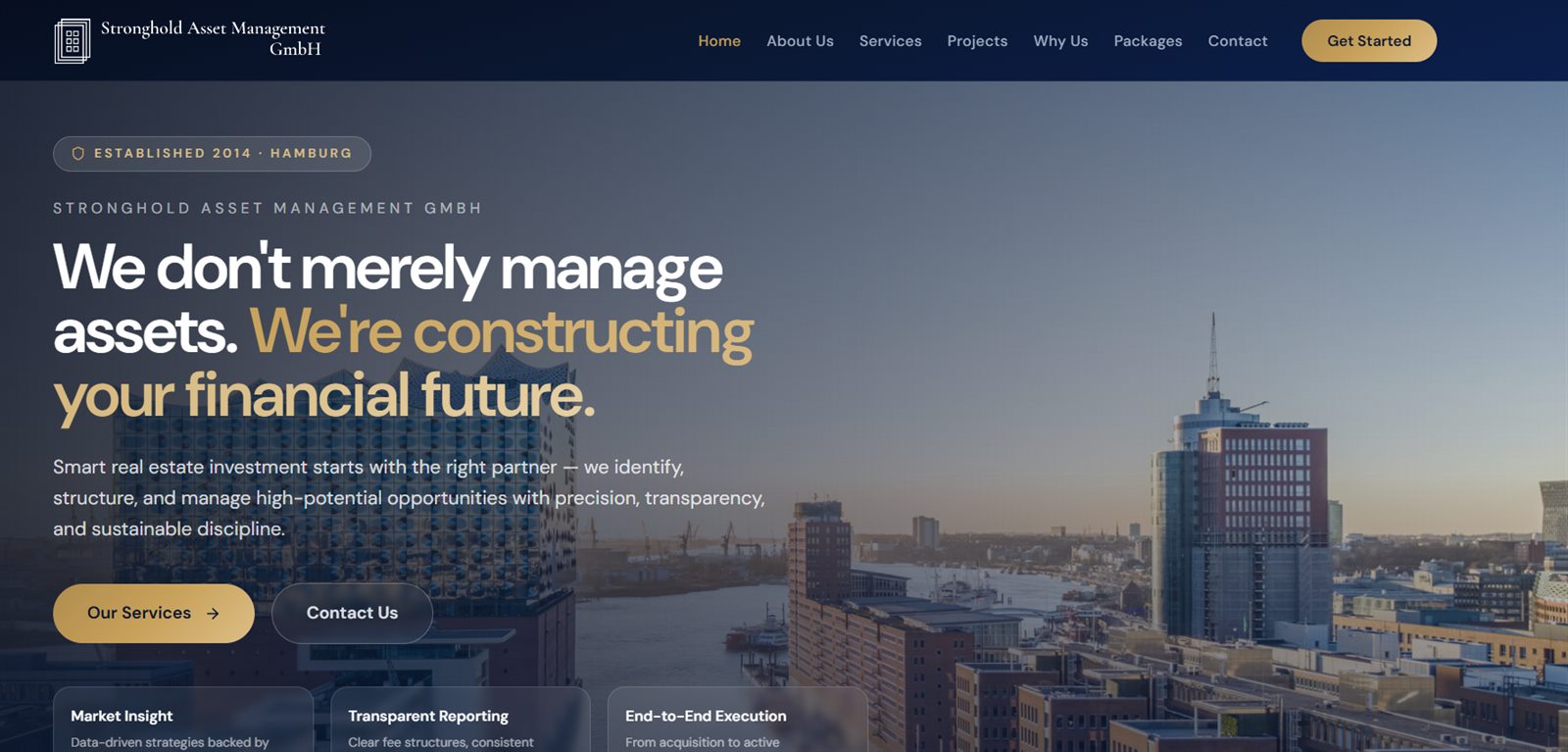
- Client
- Stronghold Asset Management GmbH, Hamburg
- Sector
- Real estate · Financial services
- Role
- End-to-end build & client revisions
- Scope
- 9 pages + dynamic service detail pages
- Timeline
- ~2 months, iterative
Stronghold Asset Management GmbH is a Hamburg-based real estate asset manager overseeing €150M in assets and more than 5,000 units across 59 German locations, serving investors in Germany, Singapore, London and Luxembourg.
The site covers the company's three core business lines — portfolio management, asset management, and property management and renovation — across nine pages, and includes a full case-study gallery for their in-house renovation service.
My role was the end-to-end build: architecture, every page and component, copywriting adjustments, image sourcing and processing, and an ongoing feedback loop directly with the client.
It was an iterative, client-driven project. The client reviewed live changes and sent rounds of written feedback — copy edits, photo replacements, section reordering, layout tweaks — which were implemented incrementally over roughly two months and confirmed back after each round.
Key features
Nine pages
- Home, About Us, Services, Projects
- Why Us, Packages, Contact, Imprint
- Dynamic per-service detail pages
Renovation case studies
- Room-by-room Before/After gallery with a drag-to-compare slider
- Full-screen lightbox viewer
- Categories for kitchen, living room, bathroom, and building & facade
- A separate "Completed Projects" section presenting renovations as narrative case studies — lead photo plus supporting grid
Motion & data display
- An animated orbiting SVG diagram illustrating the three core business areas
- Scroll-triggered counters and animated statistics
- A milestone timeline with an SVG path that draws in on scroll
- A global-reach diagram connecting Hamburg, London, Luxembourg and Singapore
Conversion & content
- Dynamic contact form
- Package comparison across Basic, Standard and Premium tiers
- A four-step "Path to Partnership" process section
- Landmark project grid sourced from the client’s own photography
The hard parts
The problems that shaped the architecture, and how each one was solved.
A token-based theme the client could drive
Rather than hardcoding hex values in components, every brand colour became a CSS custom property storing RGB channels (--c-navy-900: 11 31 77). Tailwind reads those tokens, so a palette change is a single file edit rather than a find-and-replace across the codebase.
Four palettes, compared live
Client feedback was that the original palette used too many bright, light sections for a premium financial-services brand. Instead of arguing it in mockups, a temporary in-app switcher let them flip between four complete colour palettes on the real site. Once one was approved, the switcher and unused palettes were removed, leaving one clean token file as the single source of truth.
Layouts hardened against translation
The site had to survive machine-translated content, where German compound words are far longer than their English equivalents. Text sizing and wrapping were tuned so long words could not break fixed-width layouts.
A before/after gallery built from real site photos
Renovation photography came straight from the client's projects, in mixed sizes and alignments. Each pair was cropped and aligned so the drag-to-compare slider lines up, then compressed to keep the gallery fast.
Working in the client’s review loop
Rounds of written feedback arrived over about two months. Keeping the component structure and theme tokens clean is what made copy edits, photo swaps and section reordering cheap to apply each round rather than compounding into rework.
Built with
Core
Styling
Motion
Routing
Assets
Inside the app
Tap any screenshot to open it full size.

Ready to bring your
idea to life?
Let's discuss your project and build something exceptional together. Get in touch via Fiverr or send me a message.